Project Planning Glyph Icons – A Smart Foundation for Visual Communication
When you are building a project management tool, designing a dashboard, or preparing a business presentation, the visuals you choose do more than decorate the page. They guide the eye, clarify meaning, and reduce the mental effort required to process information. Project Planning Glyph Icons offer a purpose-built set of symbols for exactly this task. But owning a good icon set and using it effectively are two different things. Many people invest in quality assets only to undermine their own work through avoidable mistakes. This article walks through the most common missteps and shows you how to get the full value out of these icons without the frustration.
What Makes Project Planning Glyph Icons Different
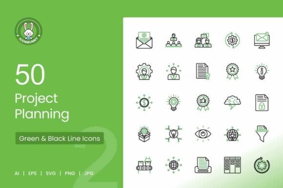
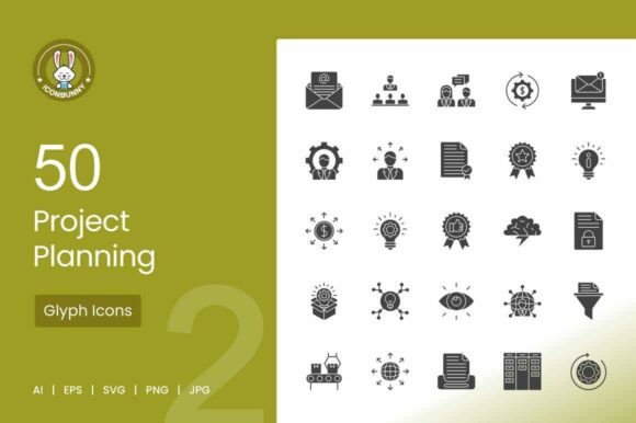
This collection includes 50 icons covering task management, strategy, scheduling, and team collaboration. You get Gantt charts, calendars, checklists, team planning symbols, resource allocation visuals, goals, milestones, timelines, and more. The set comes in multiple styles: Line, Glyph, Flat Multicolor, Filled Line, Round Filled, Blue Black, and others. Every icon is scalable, editable, and available in AI, EPS, SVG, PNG, and JPG formats at 1024×1024 pixels and 72 DPI. That level of variety matters because the same icon might need to appear on a high-res screen, a printed report, and a mobile app interface. Having one consistent set that works across those contexts saves time and preserves brand cohesion.
Mistake One – Choosing Style Before Context
A common error is picking a favorite icon style and using it everywhere without considering where the icon will live. For example, a thin Line style that looks clean on a white web dashboard might disappear when printed on a light-colored handout or placed over a busy infographic background. Similarly, a heavily detailed Flat Multicolor icon can feel cluttered when scaled down for a mobile button or a small checklist item.
Better approach: Let the medium guide your style choice. For digital interfaces, Glyph or Filled Line styles offer strong readability at smaller sizes. For printed documents or presentations projected on a screen, Flat Multicolor or Round Filled styles add visual weight and contrast. If you are designing a template that will be used across multiple platforms, choose a style that works at both extremes and test it at the smallest size it will appear. The Blue Black style, for instance, provides high contrast without relying on color, making it a reliable fallback for both digital and print use.
Mistake Two – Overlooking File Format Needs
Another frequent oversight happens at the download stage. People grab the PNG files and call it done, only to realize later that they need to resize an icon for a different layout or recolor it to match a brand palette. PNG images are raster files, so scaling them up leads to pixelation, and recoloring them requires editing software that may not preserve transparency cleanly.
Better approach: Start with the SVG or AI file. SVG is vector-based, so it scales to any size without quality loss. It also allows you to change colors, stroke widths, and fills directly in code or in vector editing tools like Figma, Sketch, or Illustrator. If you are working with a developer, supplying SVG icons reduces file weight and improves load times compared to multiple PNG sprites. For non-designers building presentations in Canva or PowerPoint, the EPS format works well because it imports as a scalable object that you can resize and recolor within the tool. Keep the PNG files for static uses where you know the exact dimensions and do not expect changes.
Mistake Three – Ignoring Consistency Across a Project
Project planning involves many concepts, and it is tempting to pull icons from different sources to cover them all. One icon might come from a free set, another from a premium pack, and a third from a screenshot. The result is a visual language that feels disjointed. Stroke weights vary, corner radii differ, and the artistic style shifts from icon to icon. This inconsistency creates subtle friction for viewers. They may not consciously notice the mismatch, but their brain works harder to parse each symbol, slowing down comprehension.
Better approach: Use one complete set for the entire project whenever possible. Because Project Planning Glyph Icons includes 50 symbols covering most common planning concepts, you can keep the visual language consistent across every screen and document. If you need an icon that is not in the set, consider whether you can substitute a related concept rather than breaking the family. Consistency in stroke width, corner style, and visual density communicates professionalism and makes the interface feel intentional.
Mistake Four – Neglecting Resolution and DPI for Print
Digital screens typically display at 72 DPI, which is why the icons in this set are delivered at that resolution. That works well for web and mobile use. But if you plan to print the icons on a poster, handout, or report, 72 DPI produces a blurry result. The 1024×1024 pixel size helps, but resolution alone does not guarantee print quality if the file is not handled correctly.
Better approach: For print, use the vector formats (AI, EPS, SVG) rather than the PNG or JPG. Vector files are resolution-independent because they describe shapes mathematically rather than as a grid of pixels. When you export to PDF or place the vector file into a layout program like InDesign or Affinity Publisher, you can set the output resolution to 300 DPI or higher without any loss of sharpness. If you must use a raster file for print, open the SVG in a vector editor, export it as a PNG at 300 DPI at the size you need, and check the output on a screen before sending to the printer.
Mistake Five – Forgetting That Icons Need Labels or Context
Icons are not universal. A symbol that reads clearly as “milestone” to one person may look like a pin or a target to someone else. Project planning icons are designed to be intuitive, but they still benefit from a text label or a contextual clue, especially when used in dashboards or tooltips. Omitting labels can confuse new users or stakeholders who are not familiar with the visual shorthand.
Better approach: Use icons as enhancements to text, not replacements. In a dashboard, place the milestone icon next to the heading “Key Milestones” instead of relying on the icon alone. In a mobile app, pair the calendar icon with a date label. The icons reinforce the message and speed up scanning, but the text ensures clarity for everyone. This combination also improves accessibility for users with visual impairments or cognitive differences who may rely on text to navigate.
Mistake Six – Overcomplicating Color Without a System
Multicolor icons look attractive, but applying them without a color strategy creates visual noise. If every icon in a set uses different colors pulled from different parts of the palette, the overall design feels chaotic. This is especially problematic in project planning tools where color often carries meaning: red for overdue tasks, green for completed items, yellow for in progress. Using a multicolor icon that includes red, green, and yellow in the same symbol can conflict with that color-coding and confuse the user.
Better approach: Establish a color rule before you start placing icons. For functional interfaces, use monochrome or duotone styles (Glyph, Line, Blue Black) and reserve color accents for status indicators or call-to-action buttons. For marketing materials or presentations where visual appeal matters more, use Flat Multicolor icons but limit the palette to two or three brand colors plus a neutral. Edit the vector files to swap the original colors for your brand colors. This keeps the icons cohesive and prevents them from competing with the content.
What to Check Before You Commit to an Icon Set
Before you buy or download any icon collection, look beyond the preview images. Check whether the set includes all the specific concepts you need for your current project, not just generic symbols. Verify that the file formats match your workflow—if your team uses Figma primarily, SVG support is critical. Confirm the license terms allow the intended use, whether it is commercial, personal, or embedded in a software product. Finally, test a few icons at the actual size they will appear in your interface or document. An icon that looks perfect at 200×200 pixels may lose definition or readability at 32×32 pixels, especially in a thin line style.
Practical Workflow for Getting the Most Out of These Icons
Start by identifying the core concepts you need to represent. Map each concept to the most intuitive symbol in the set. Then choose one style for the entire project and open the corresponding file folder. Import the vector files into your design tool. Create a color palette that matches your brand, and apply it consistently across all icons. If you are building a web interface, export SVG files individually and optimize them with a tool like SVGO to reduce file size. For a presentation, import the EPS or SVG directly into your slide software and resize without rasterizing. Keep a copy of the original files in a dedicated asset library so future projects can reuse them without searching through downloads.
The Value of Getting This Right
When you choose and apply icons thoughtfully, the benefits accumulate. Your interface becomes faster to scan because users recognize symbols at a glance. Your presentations look more polished because the visual language stays consistent from slide to slide. Your development team spends less time resizing and recoloring because the vector files are scalable and editable. And your audience—whether they are team members, clients, or stakeholders—trusts the clarity of your communication. Project planning is already complex enough. Let the icons do their job without introducing new problems.
Invest a few extra minutes at the start to match the style to the context, use the right file formats, keep the visual language consistent, and pair icons with text labels. That small effort turns a good icon set into a genuinely useful tool that supports your work rather than complicating it.